Est. 2017 · Lagos · Tallinn
Scroll to explore
We Build
Brands That
Move People
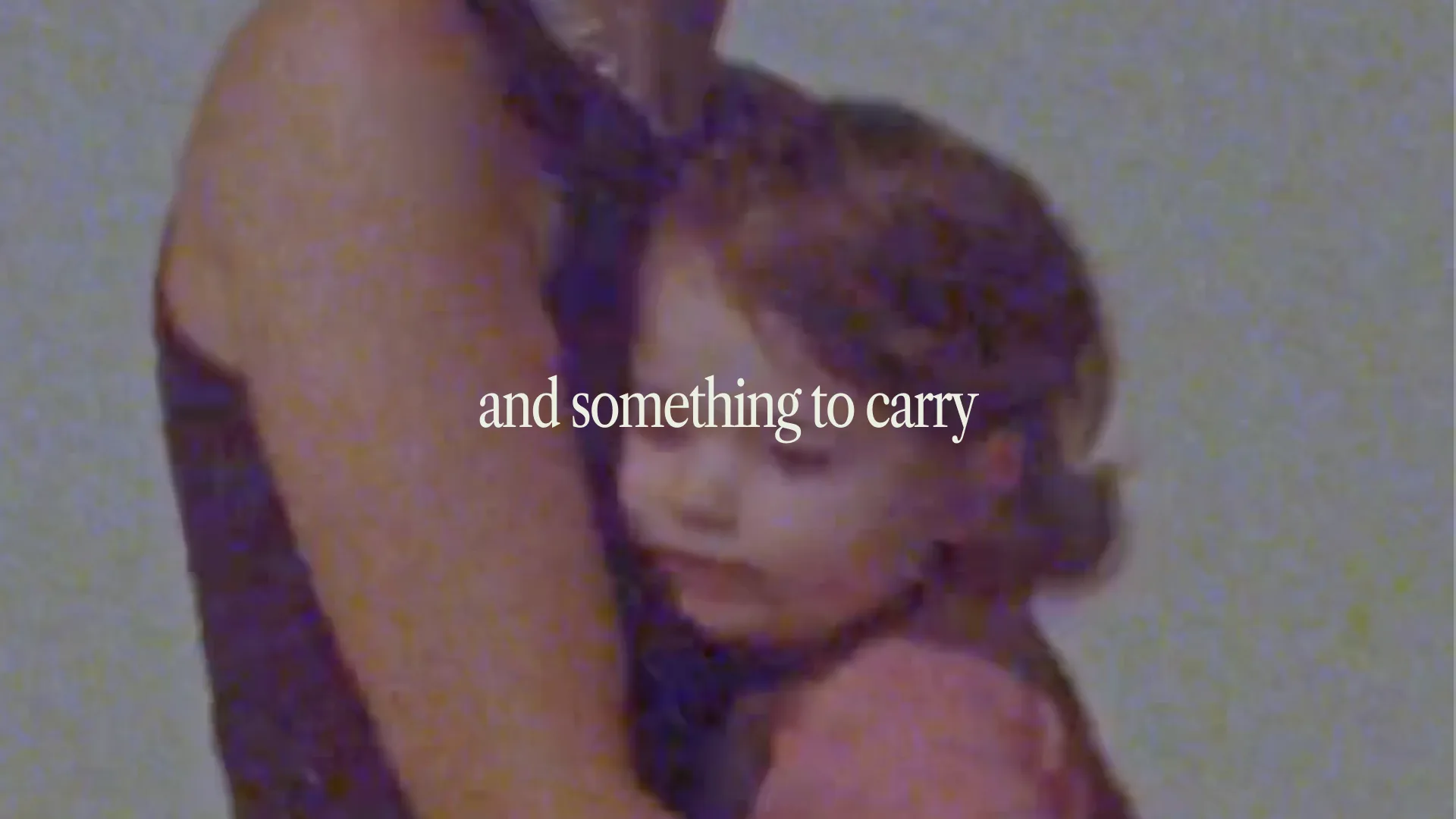
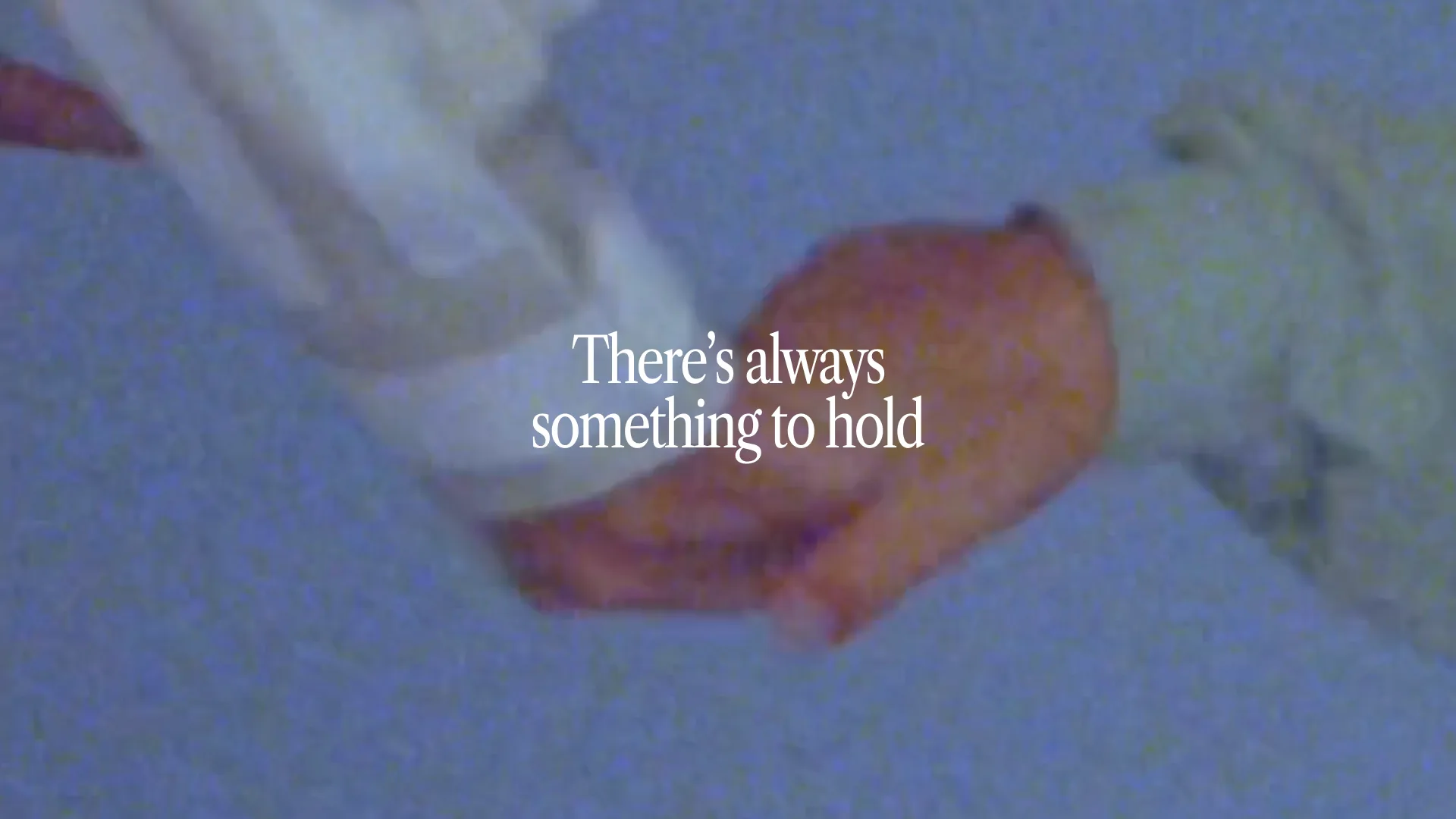
Myndzone Media is a creative studio at the intersection of strategy, identity, and storytelling. We make brands that look good and connect. From Lagos to Tallinn, we craft experiences that move people.
Brand Strategy✦Art Direction✦Motion Design✦Visual Identity✦Creative Direction✦Web Design✦Digital Marketing✦Brand Strategy✦Art Direction✦Motion Design✦Visual Identity✦Creative Direction✦Web Design✦Digital Marketing✦
Selected Work
'17 '25
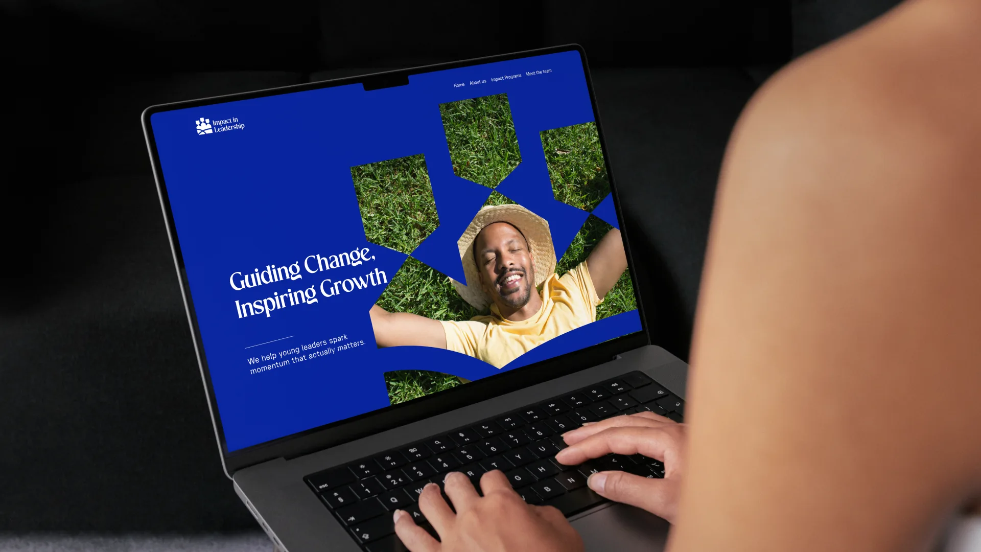
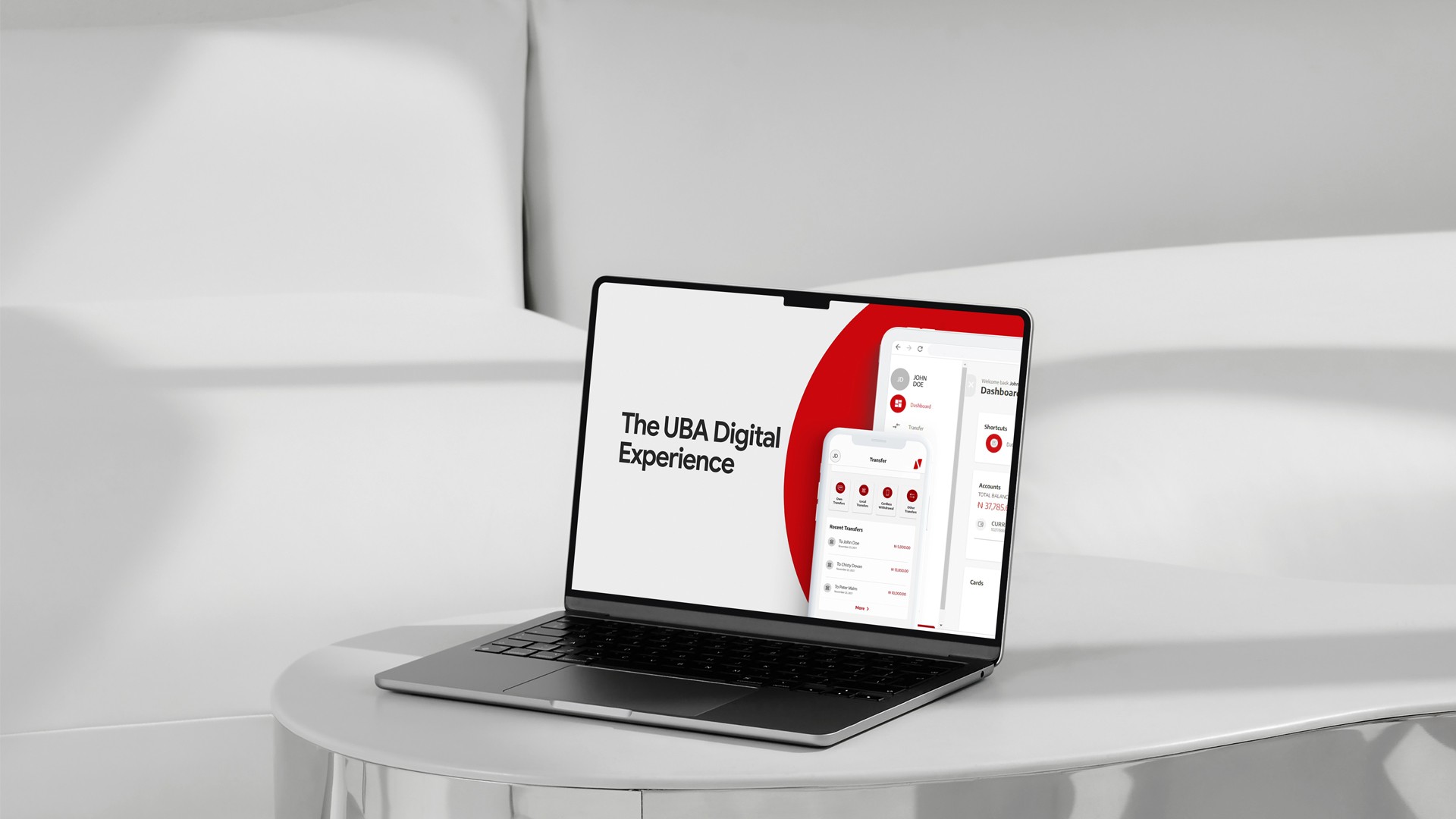
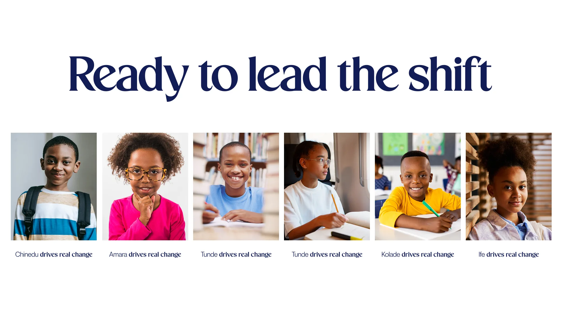
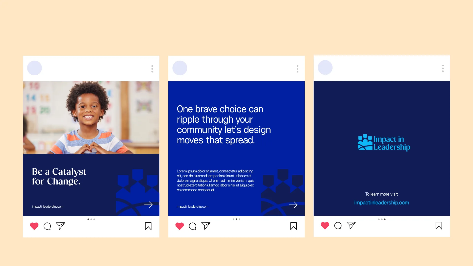
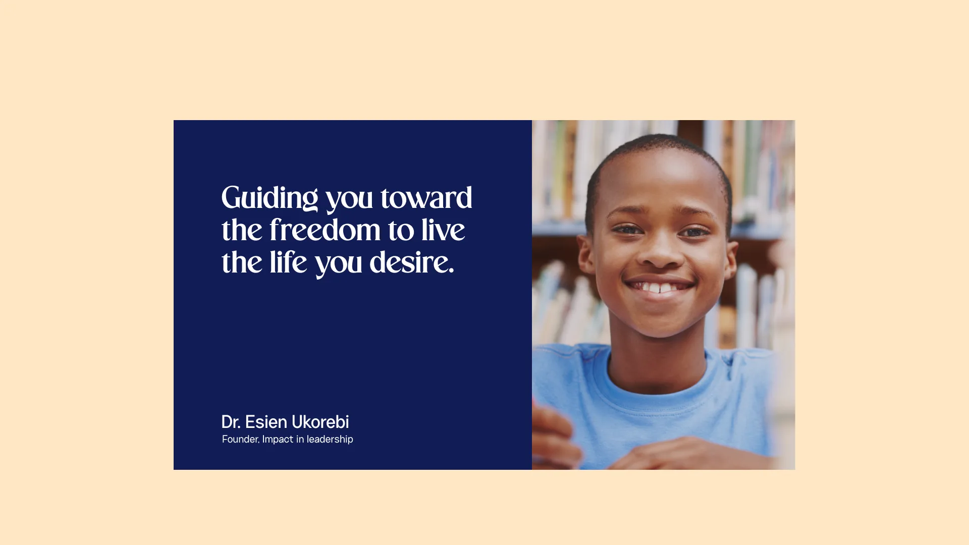
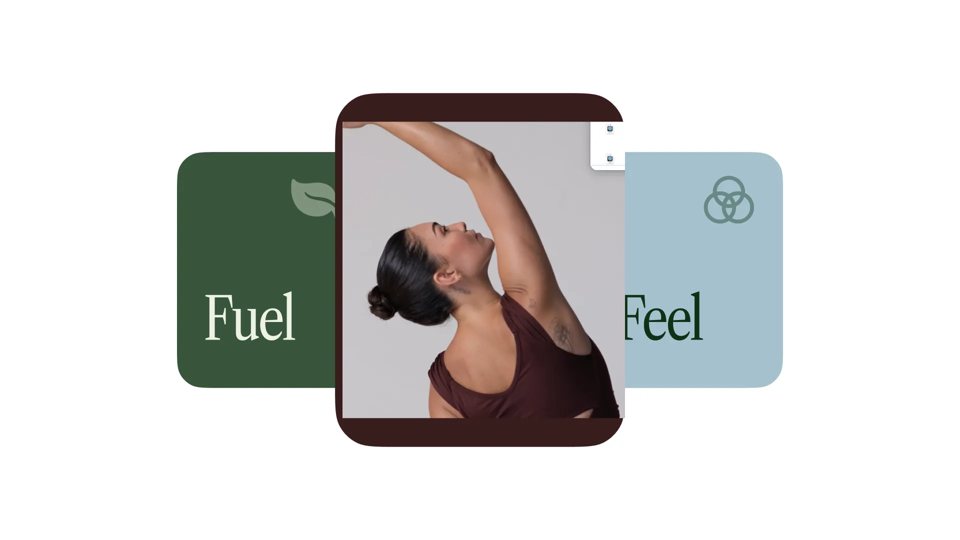
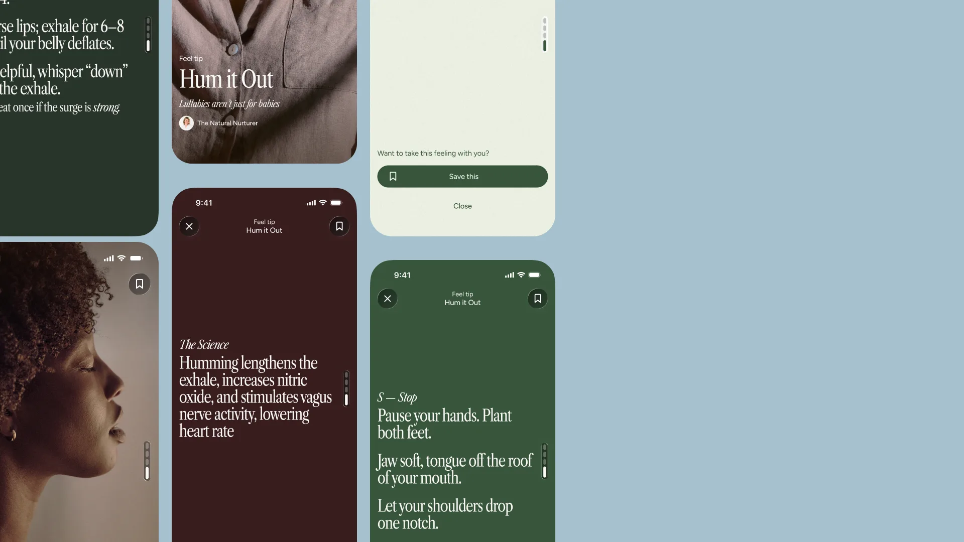
Impact in LeadershipBranding

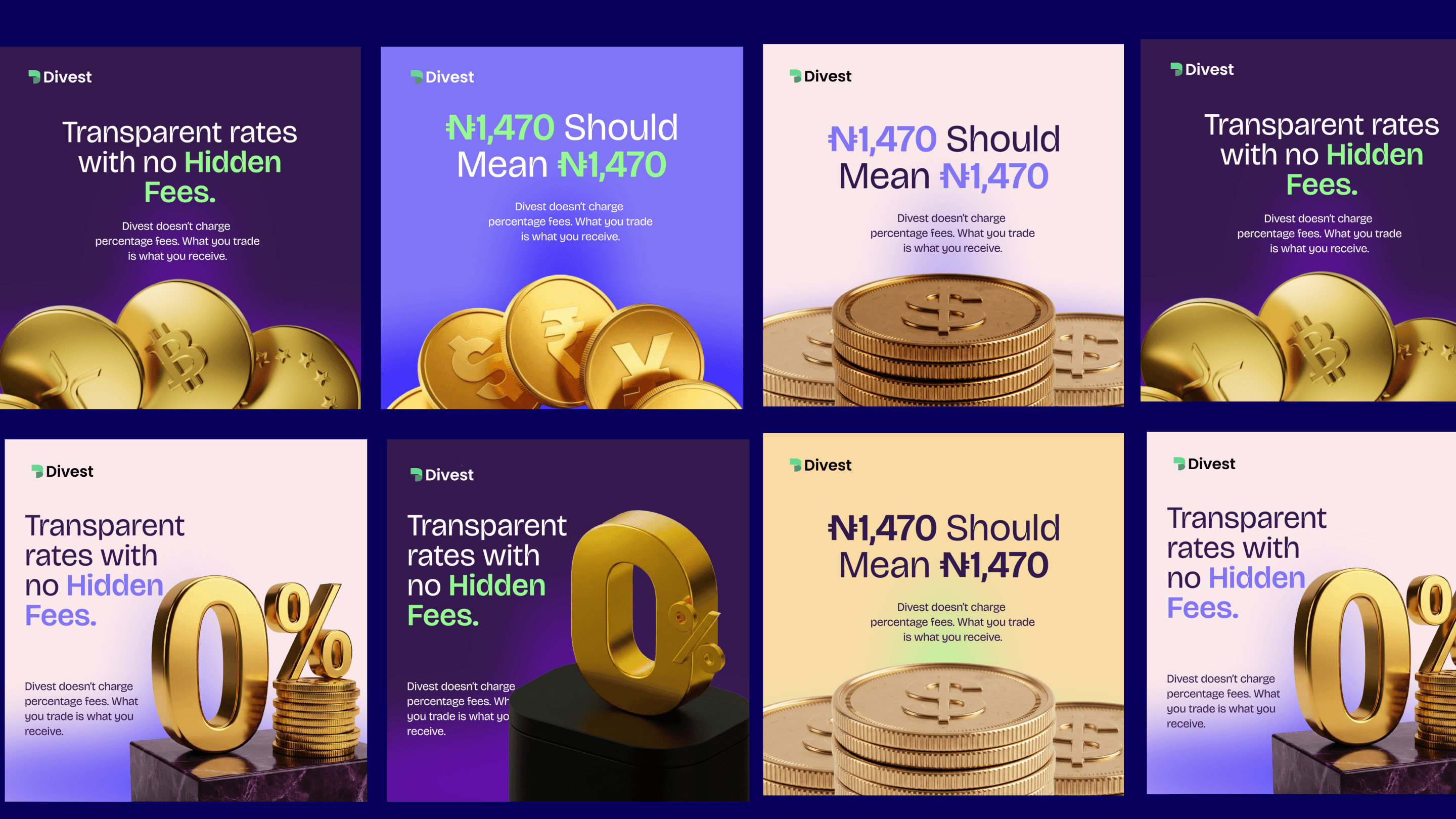
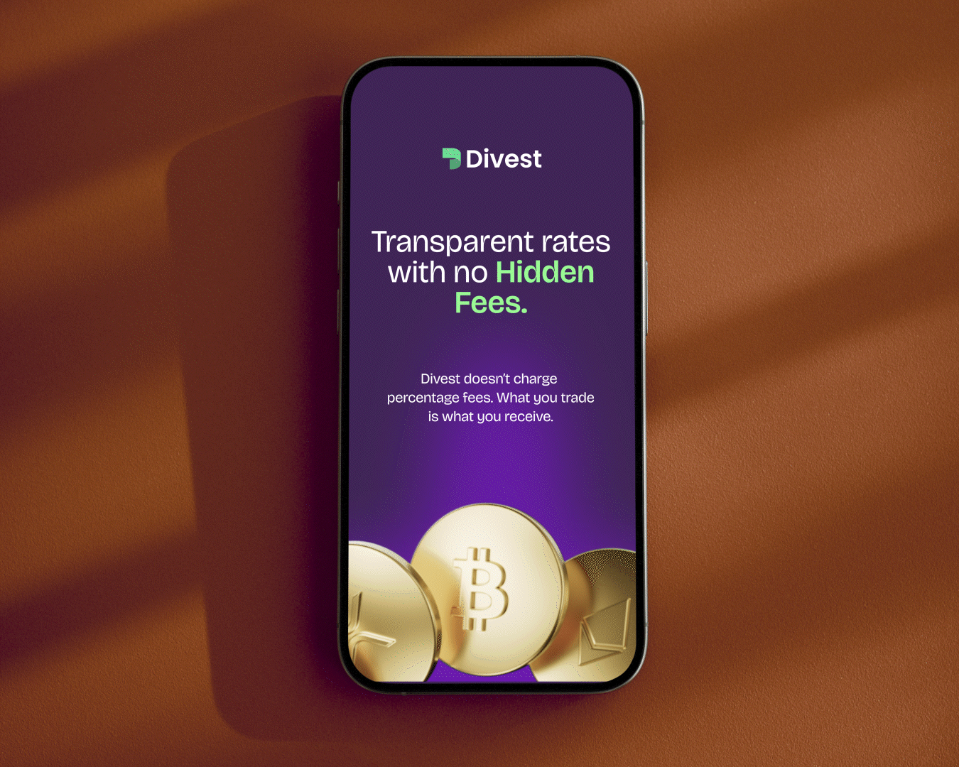
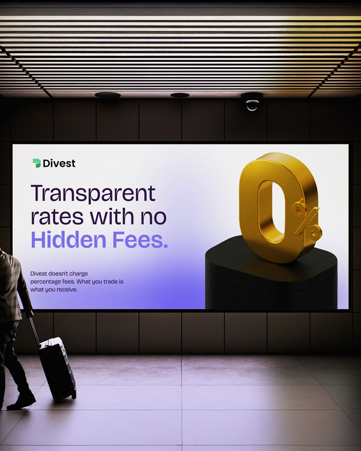
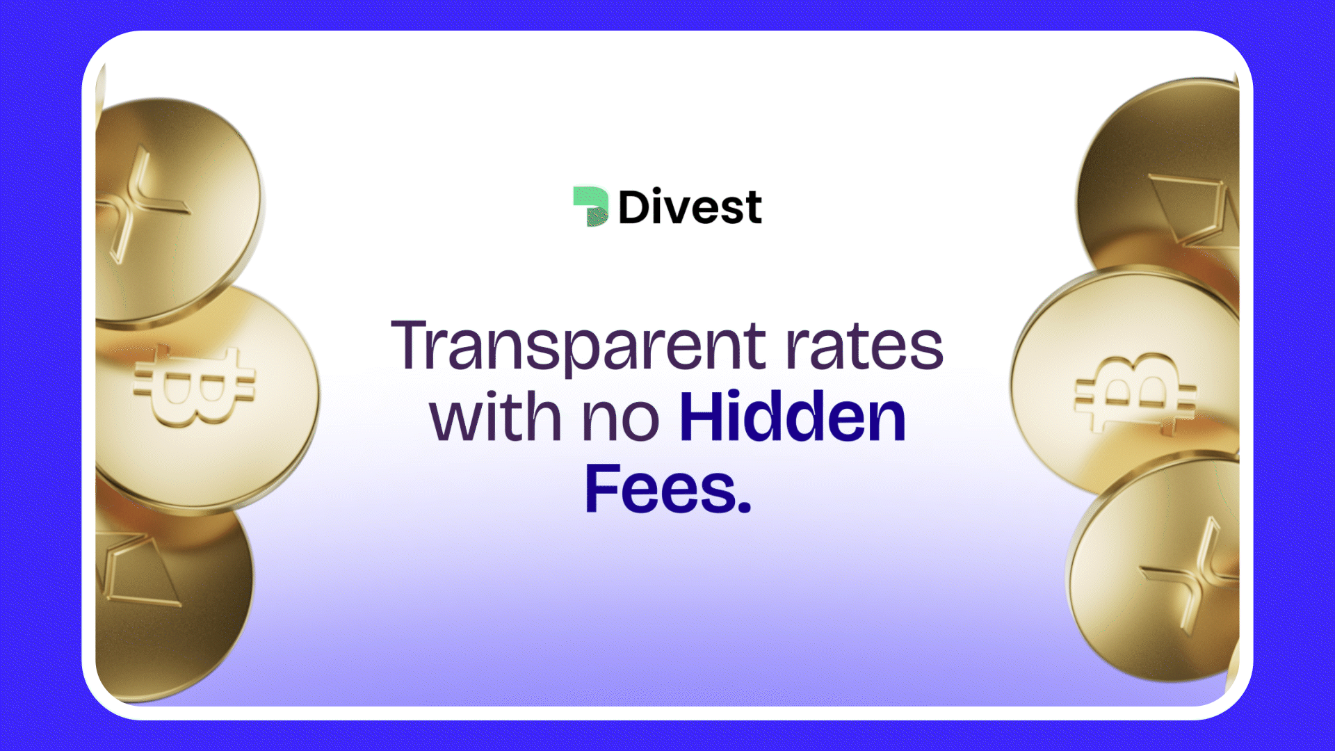
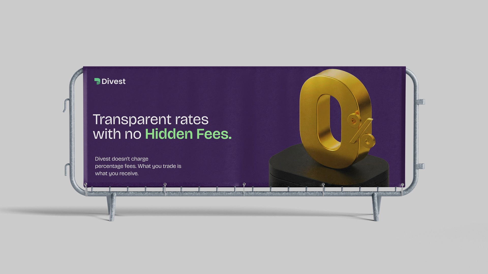
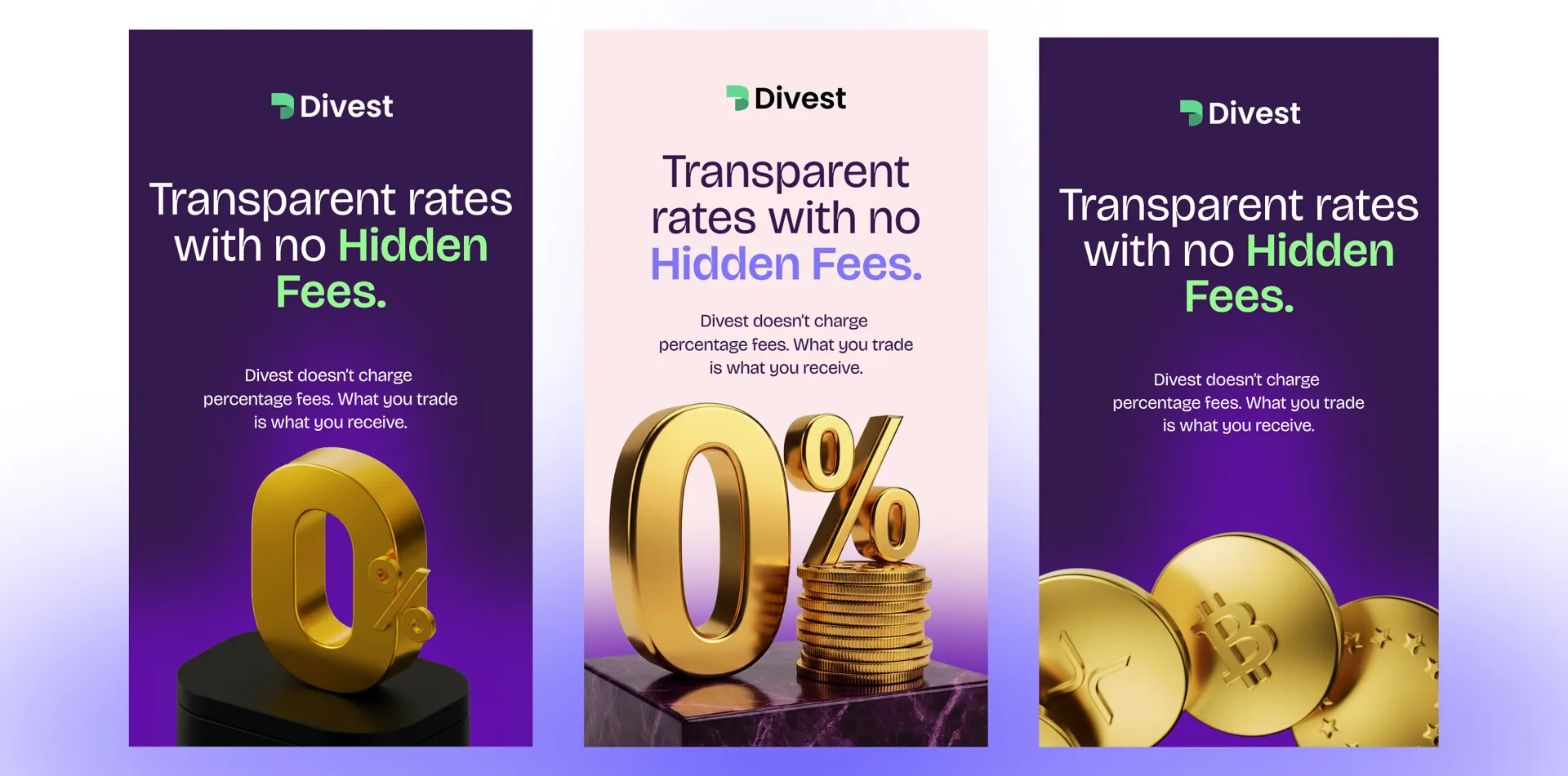
DivestDigital Marketing
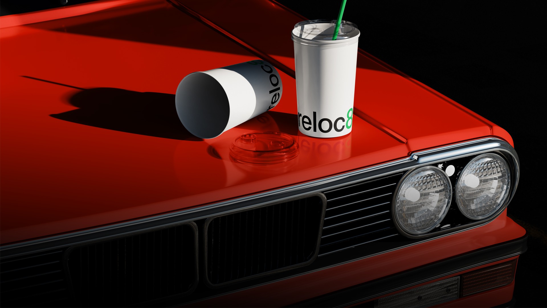
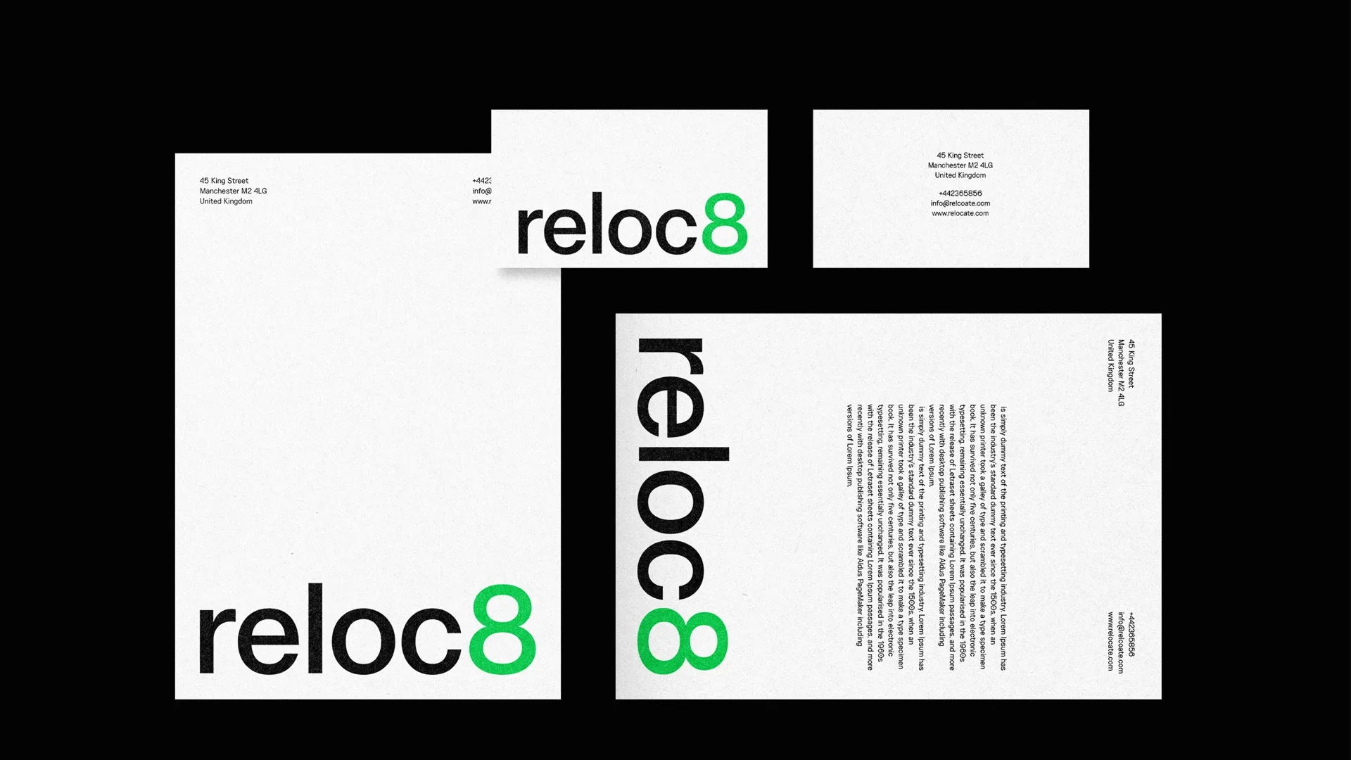
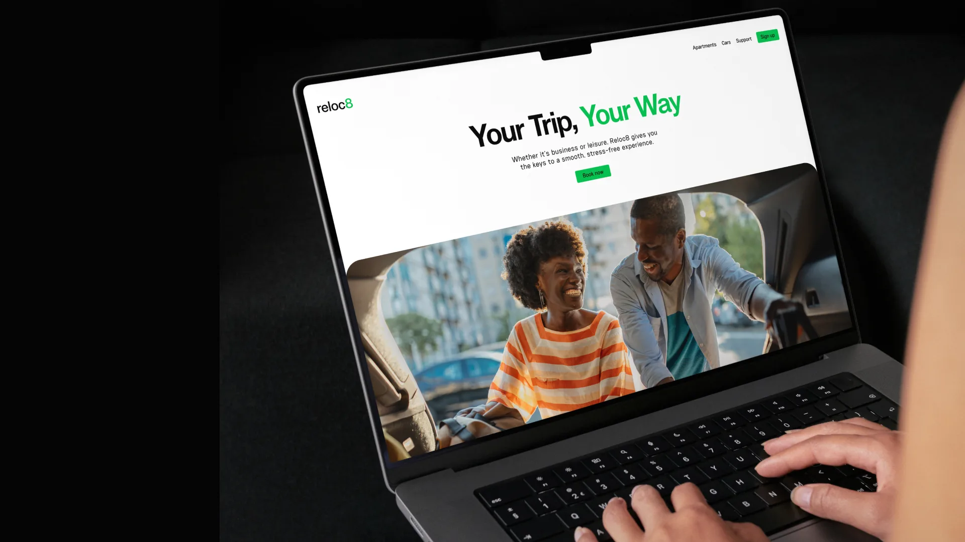
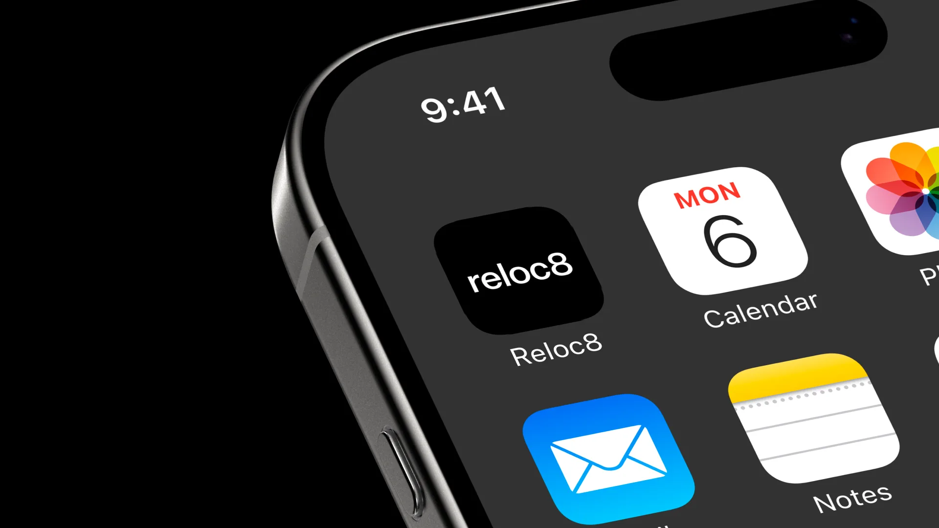
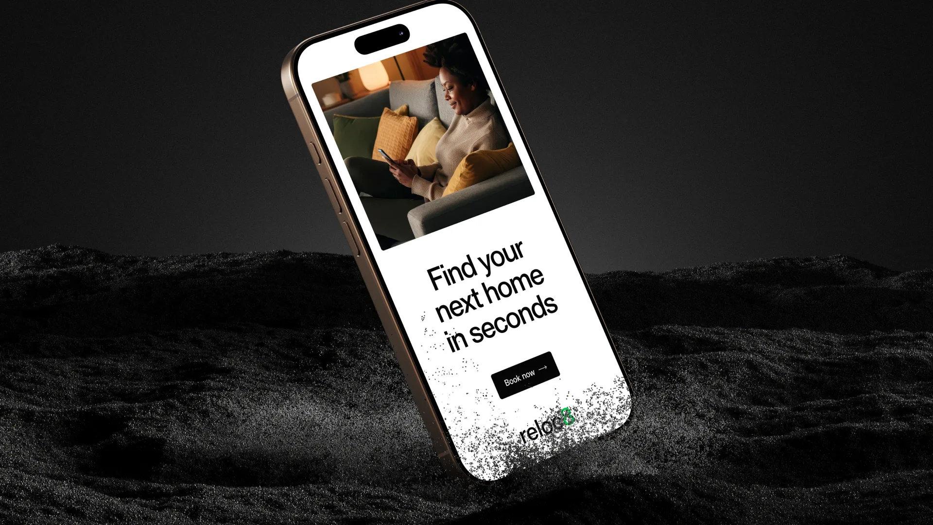
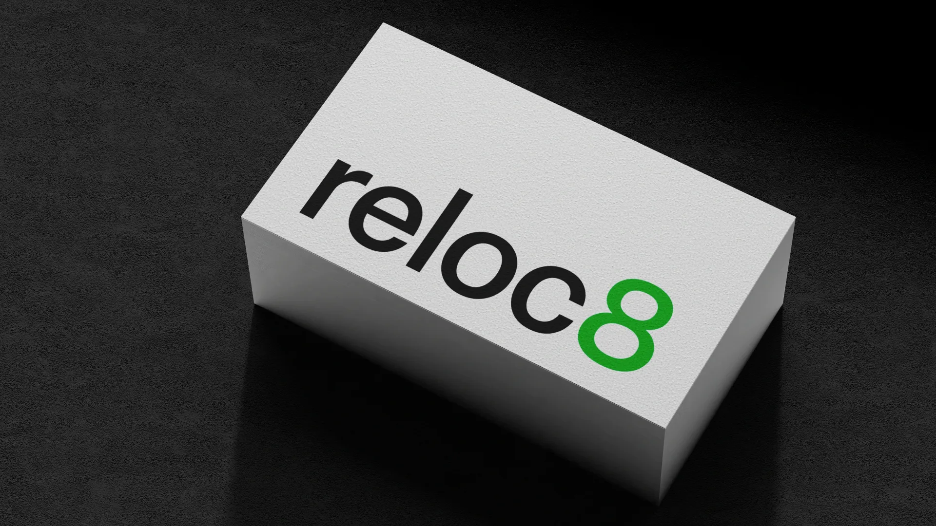
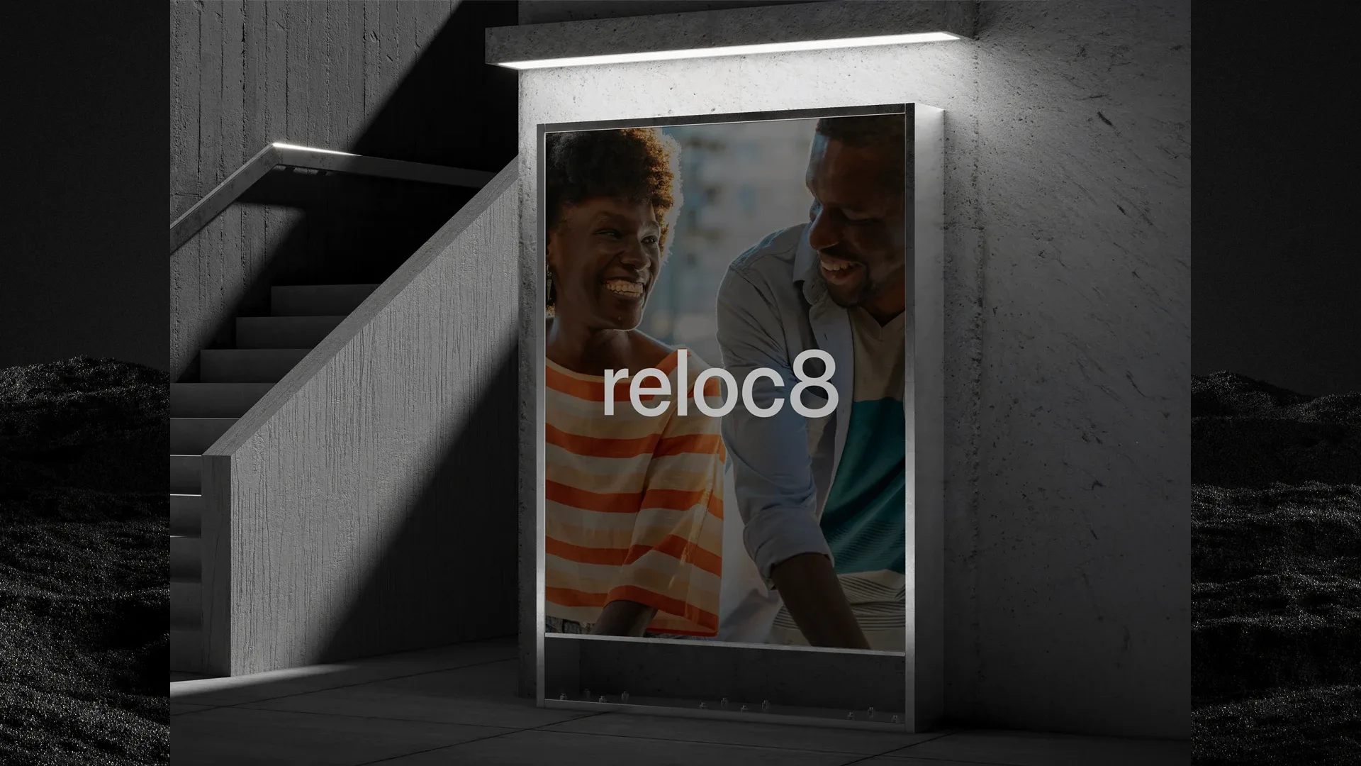
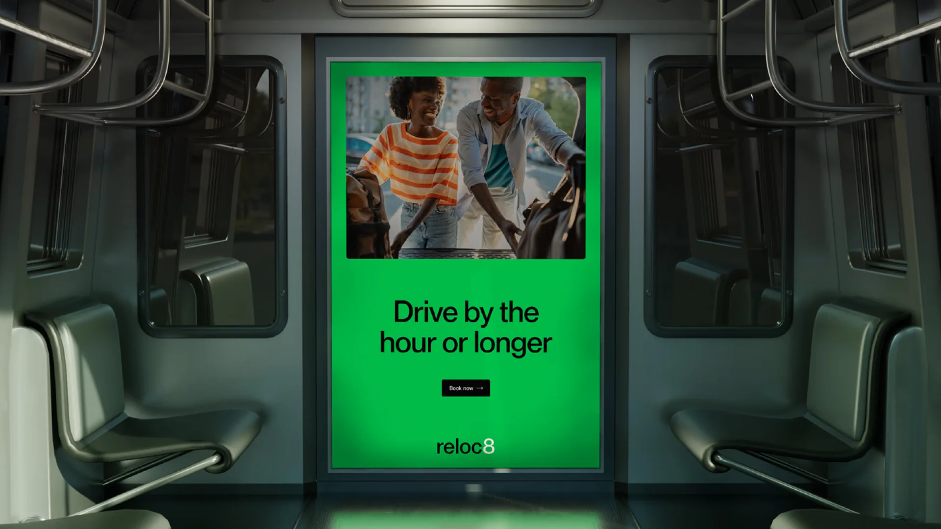
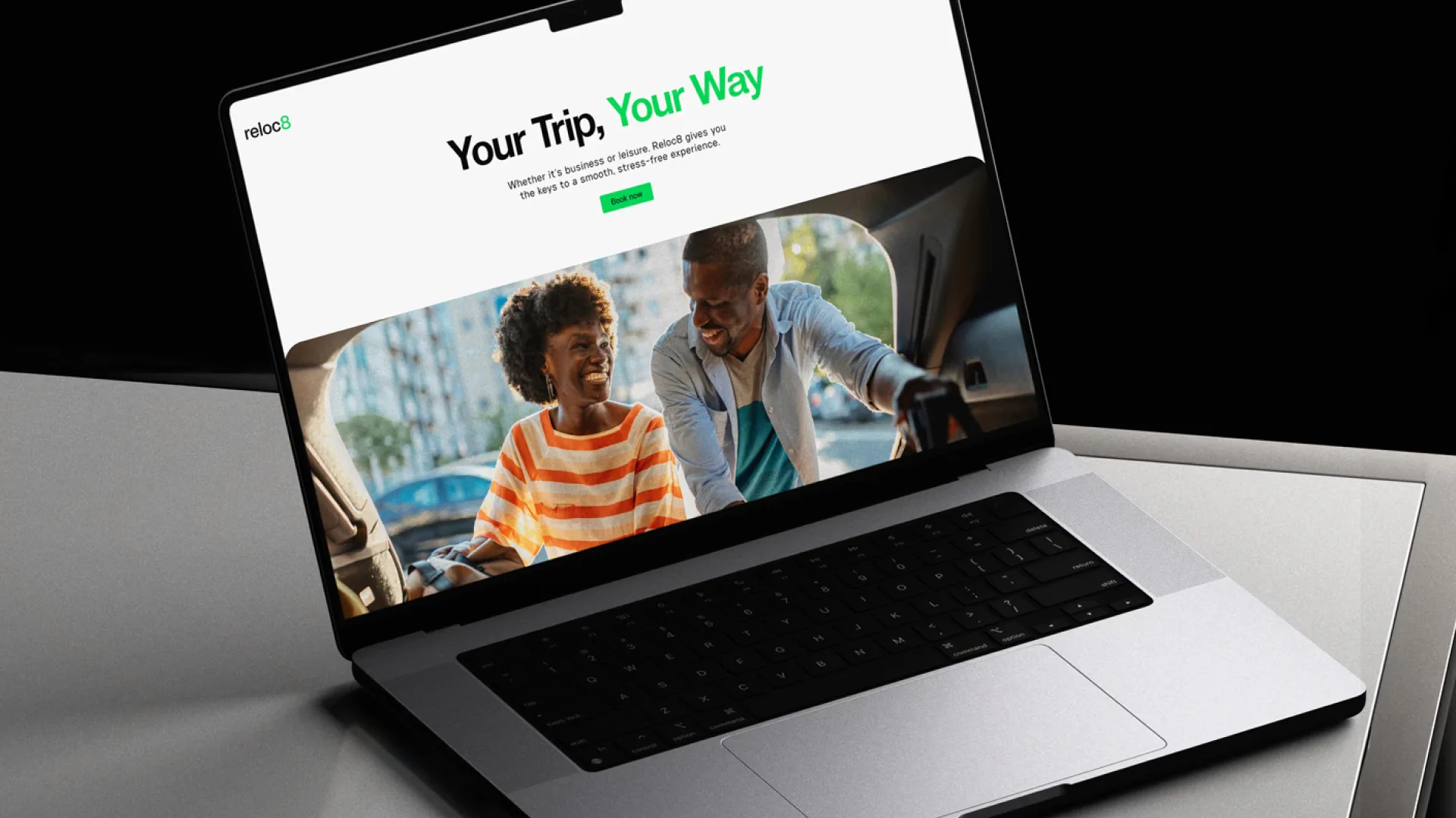
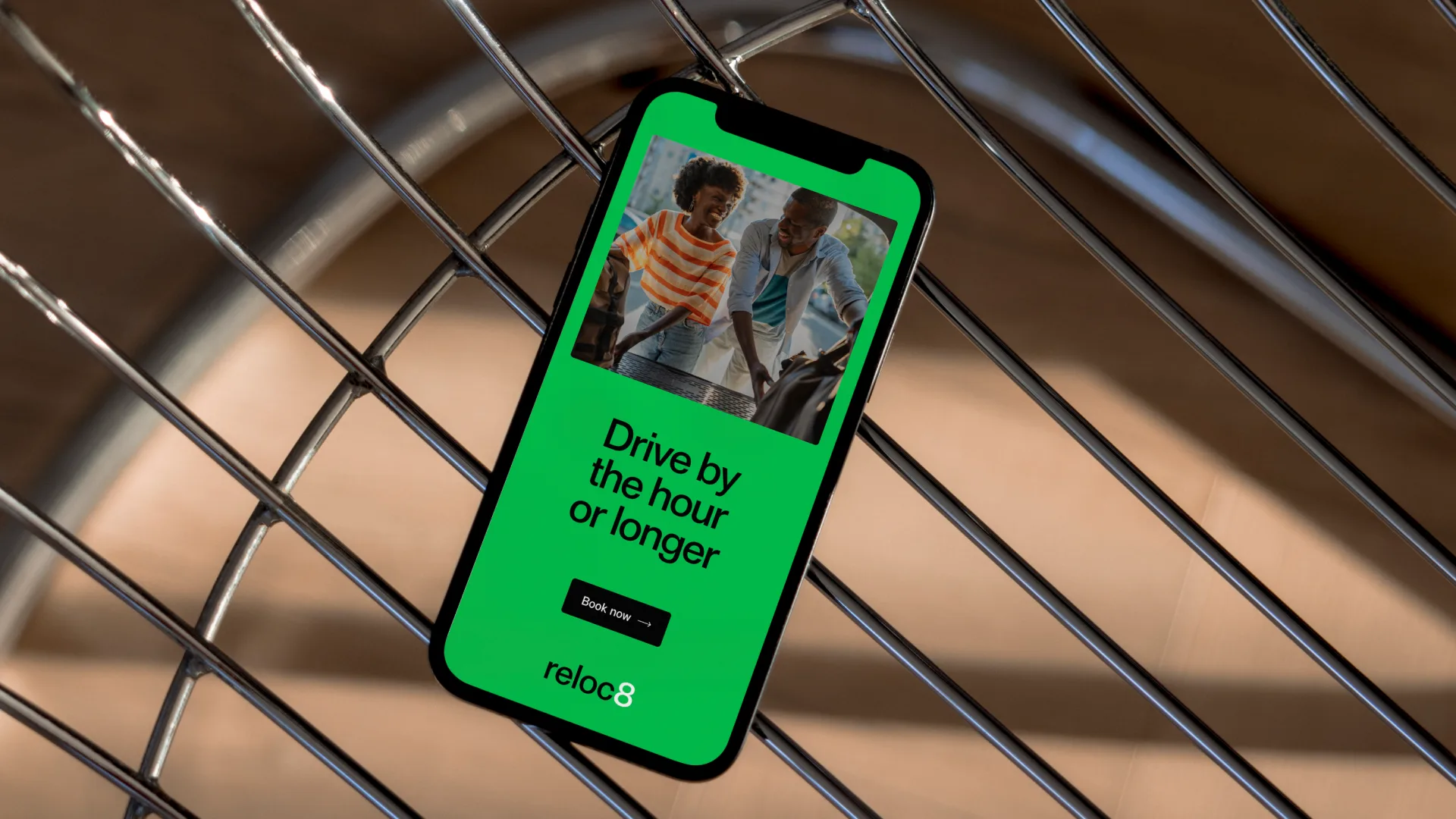
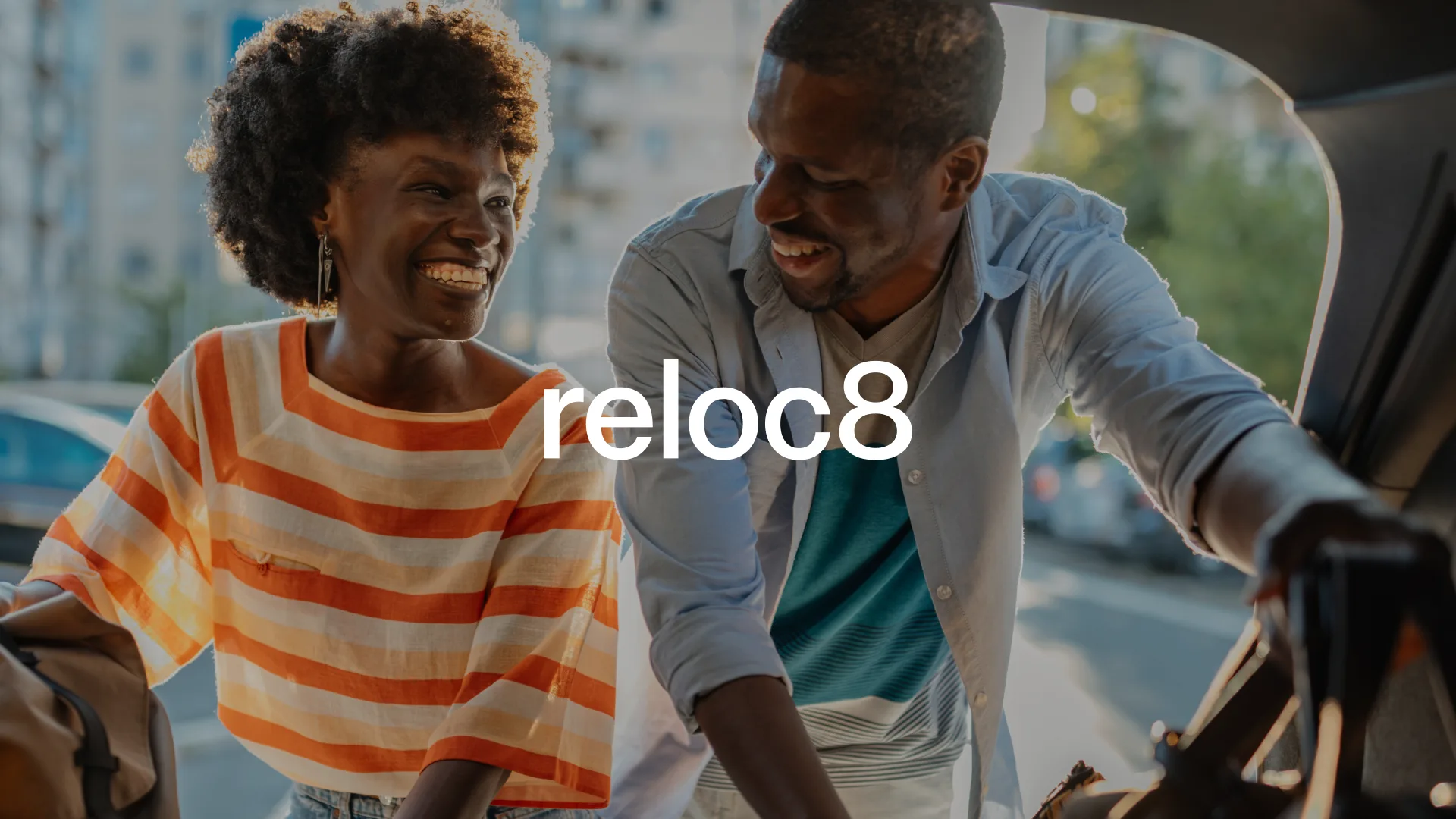
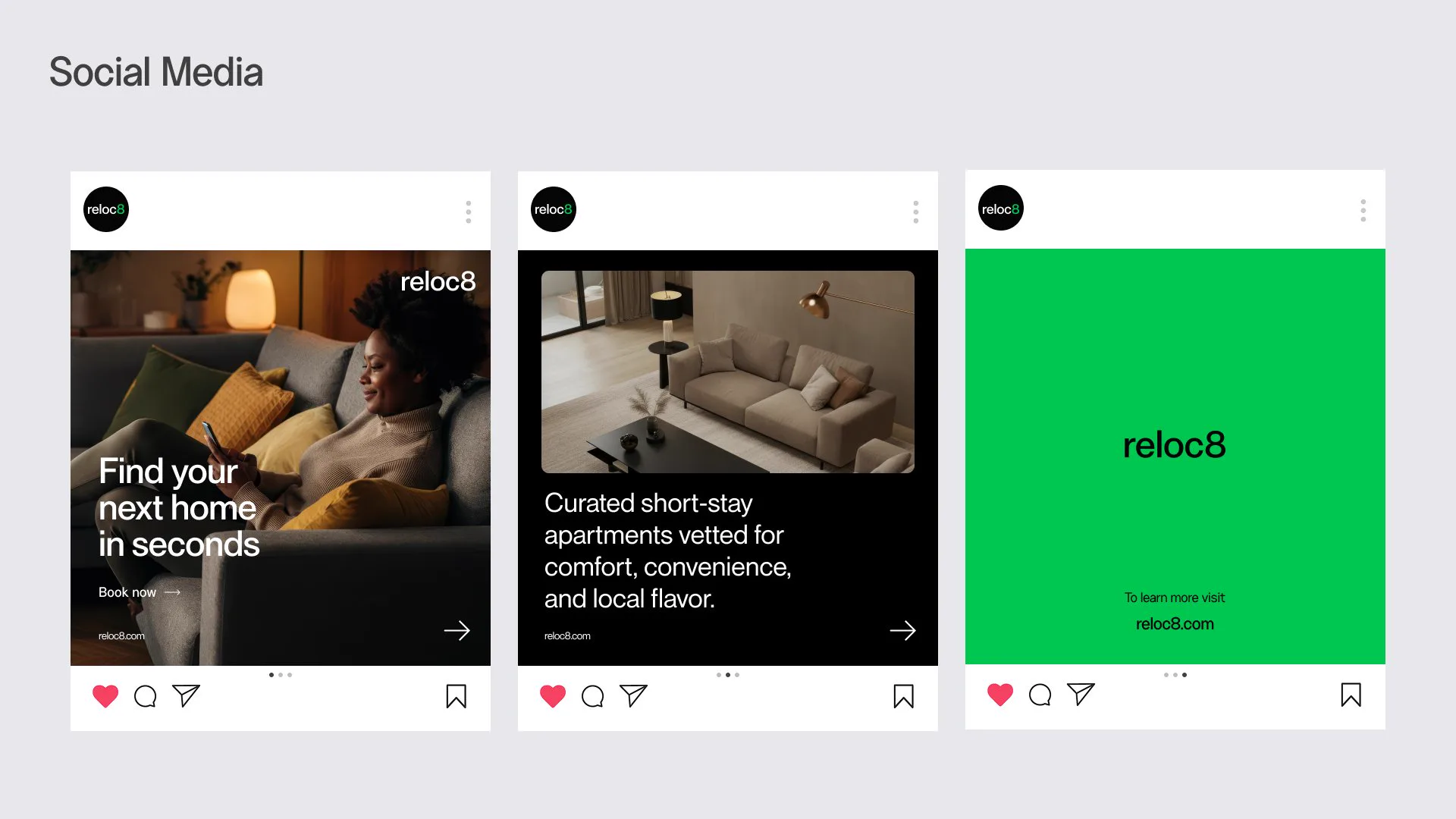
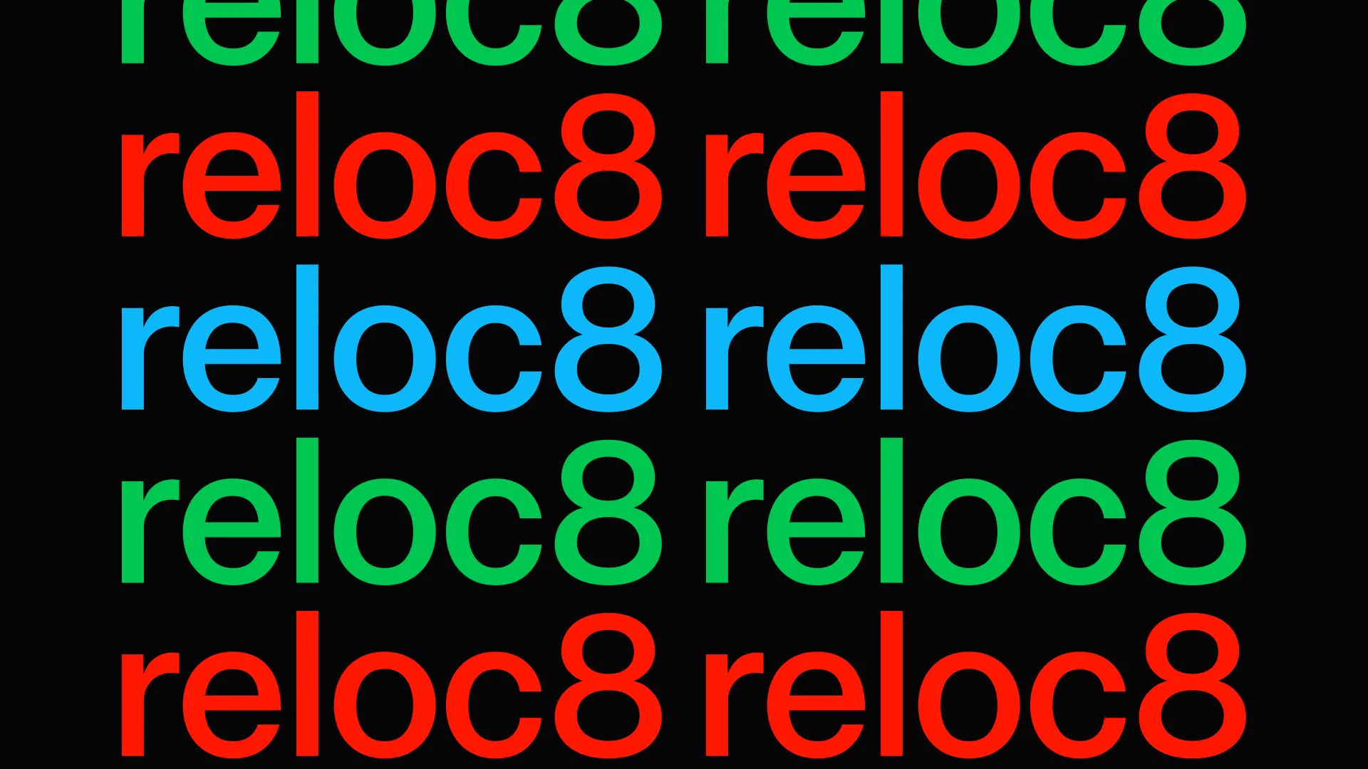
Reloc8Brand Identity
Fund 727Animation
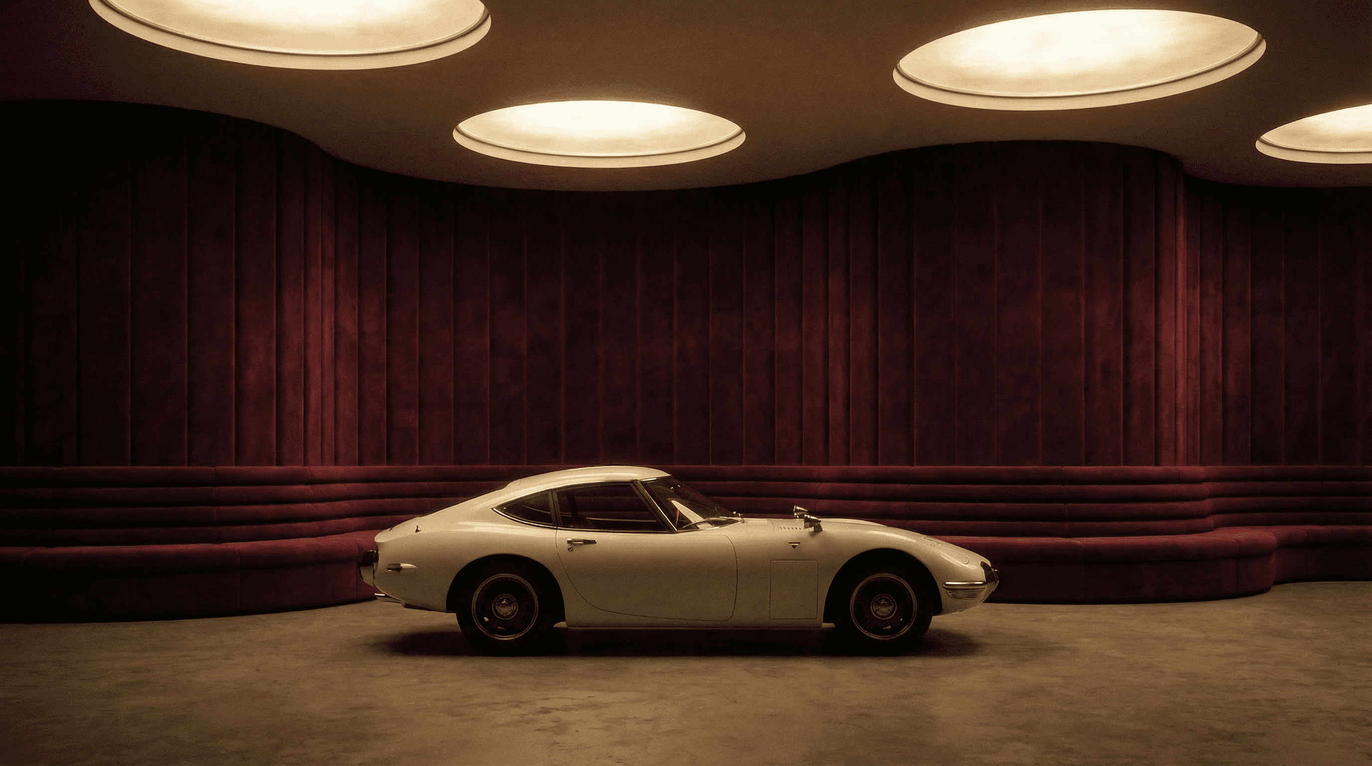
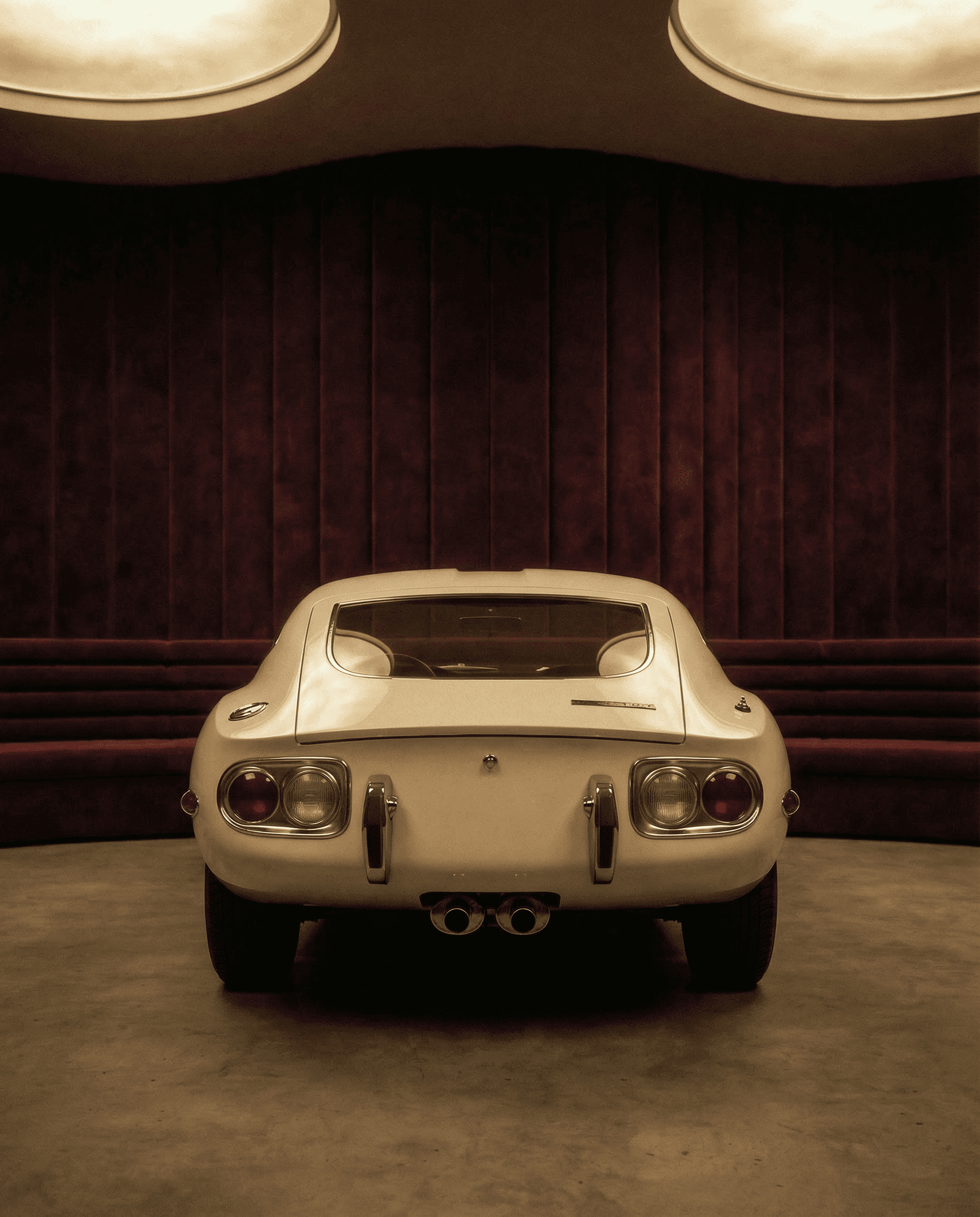
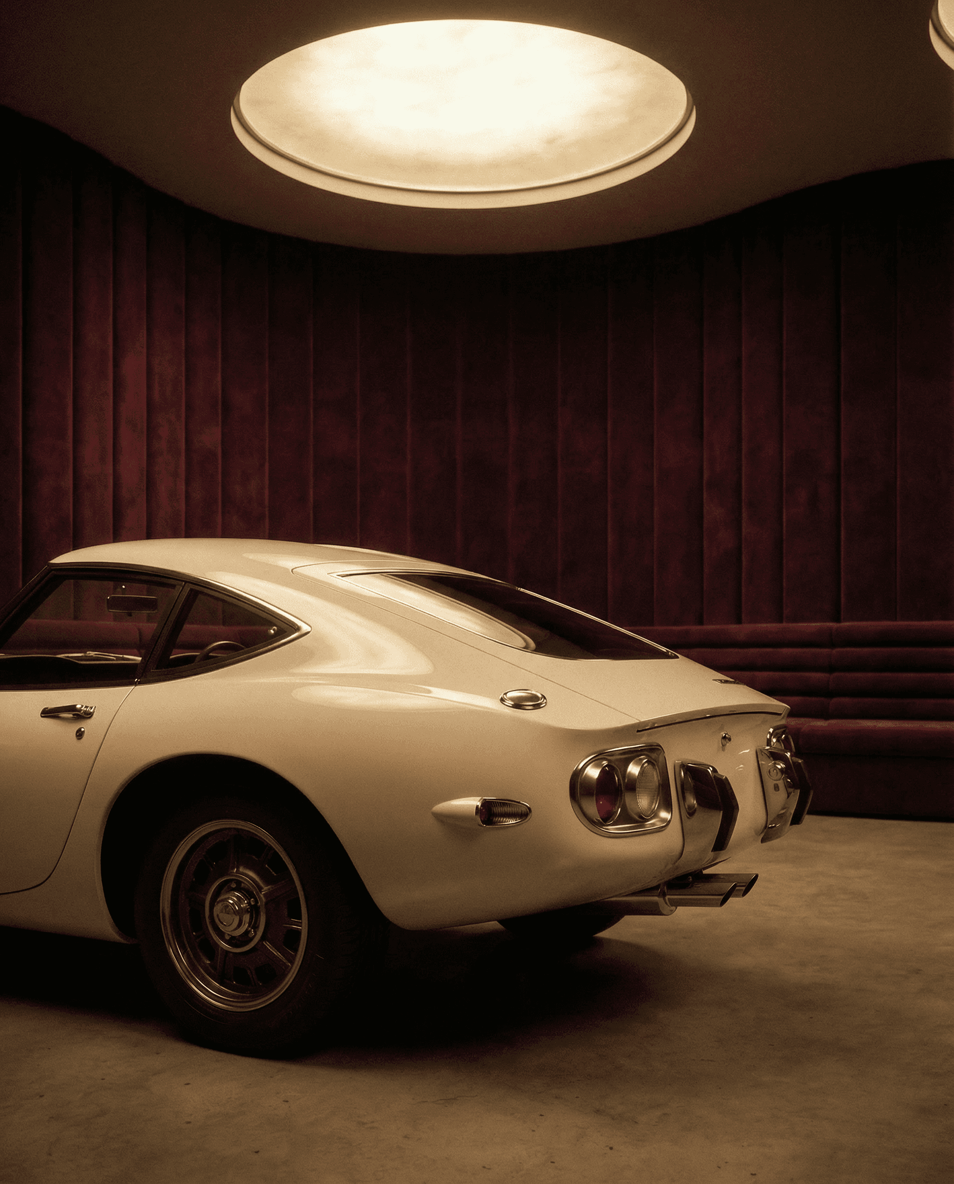
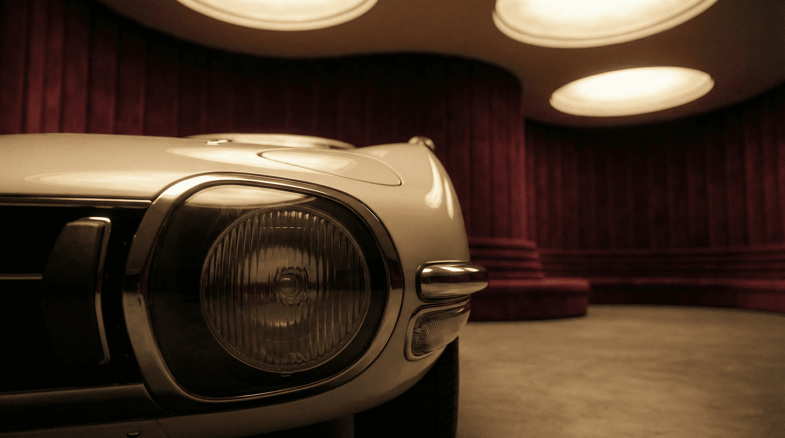
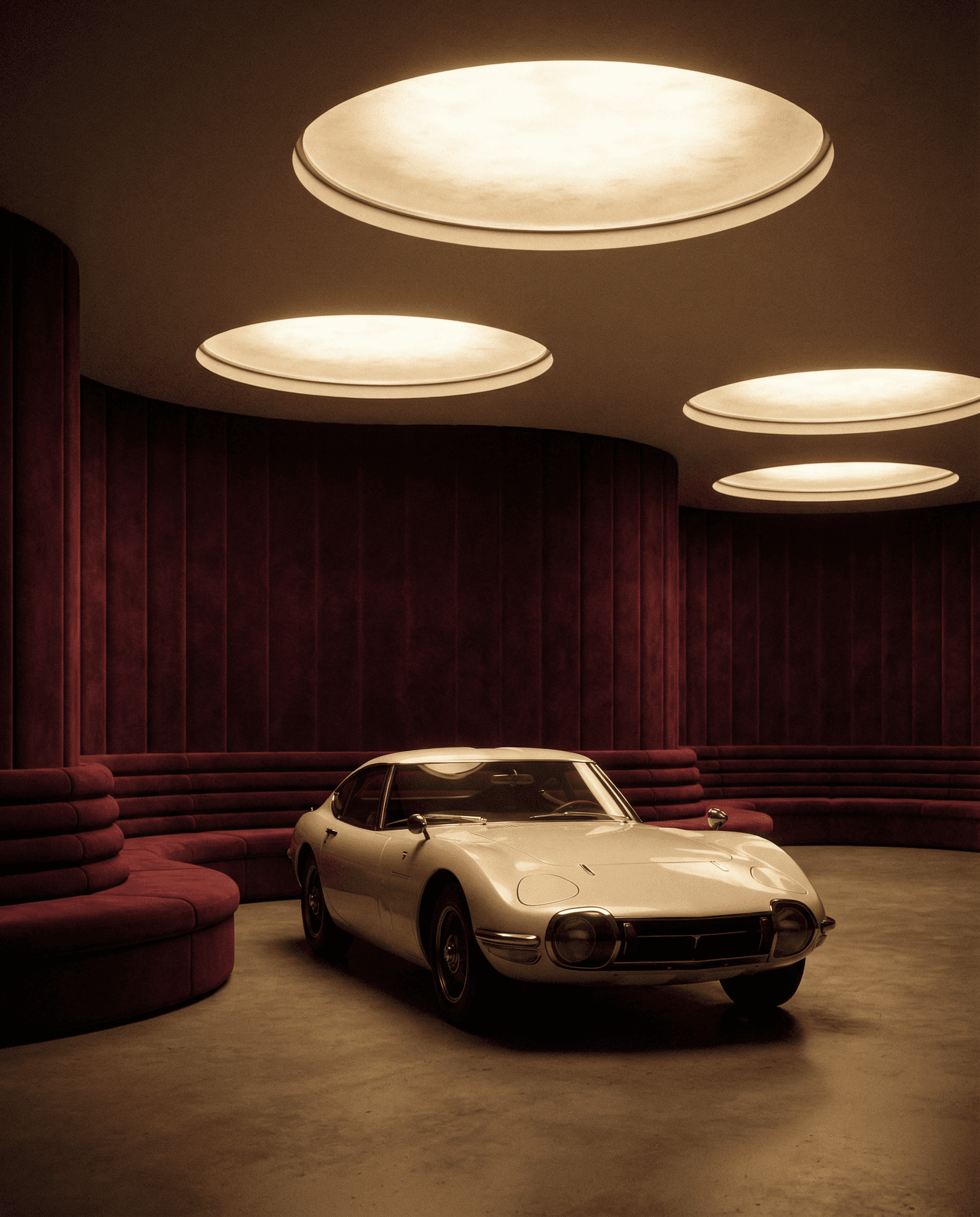
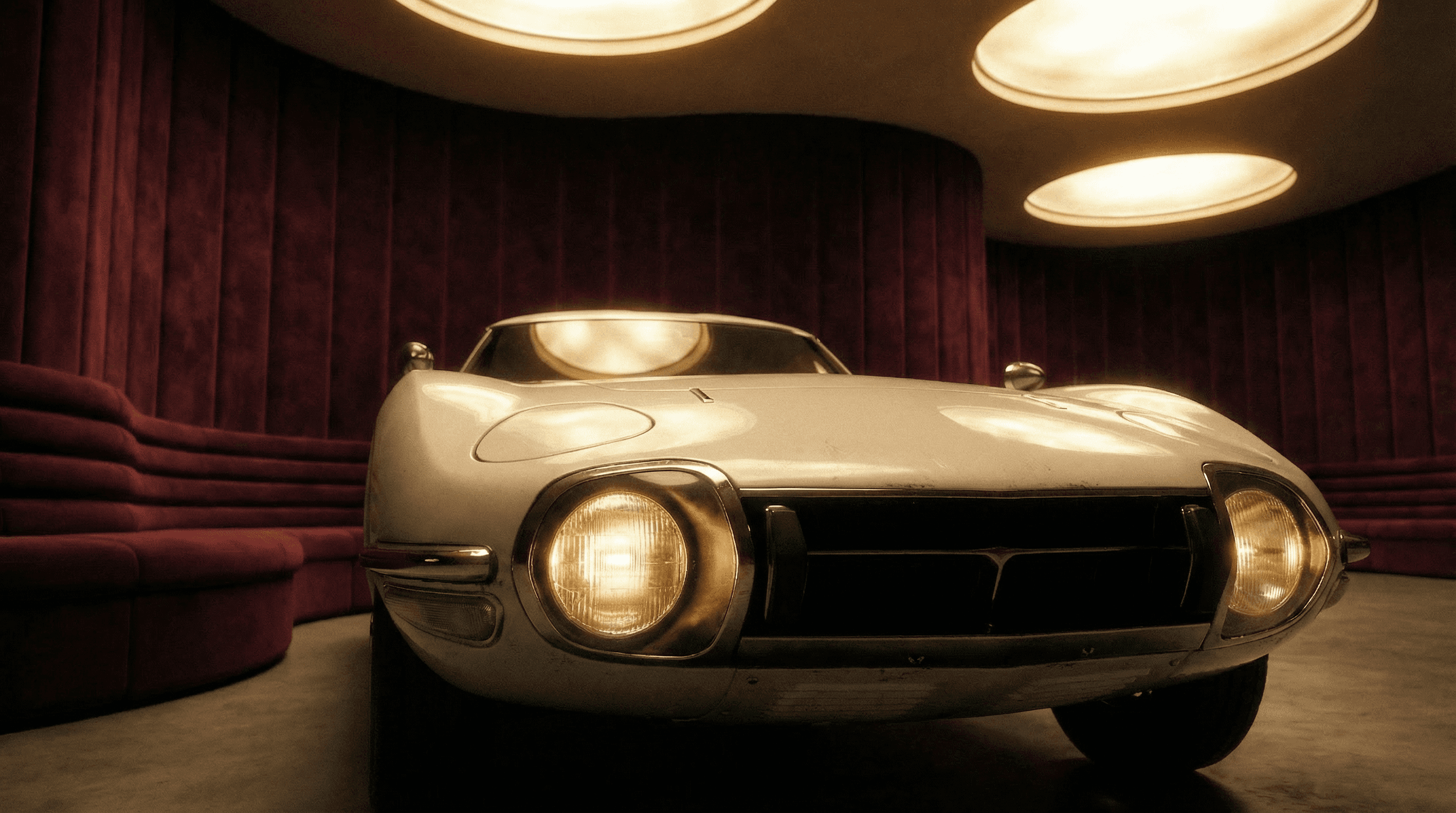
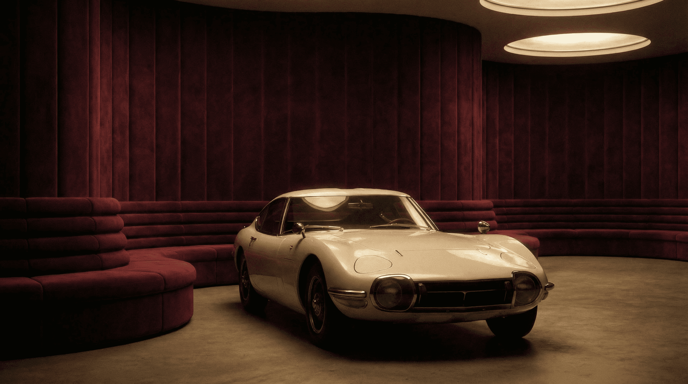
Nano BananaPersonal Project
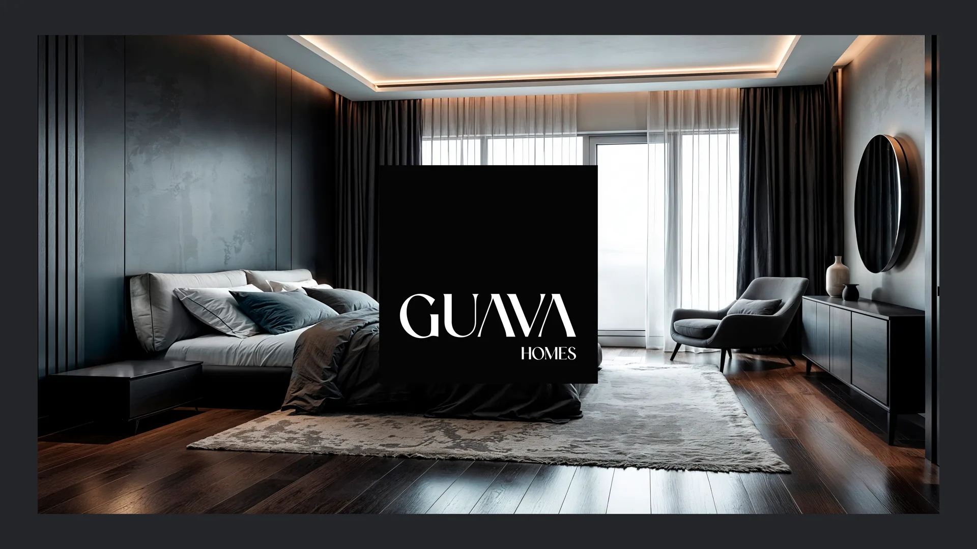
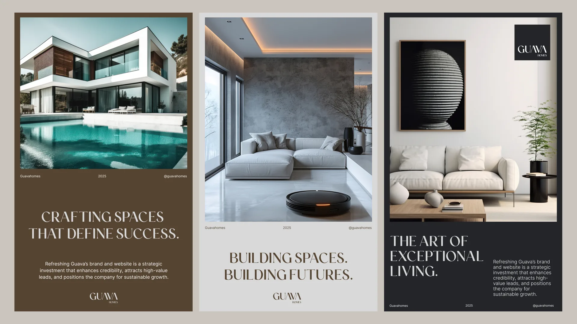
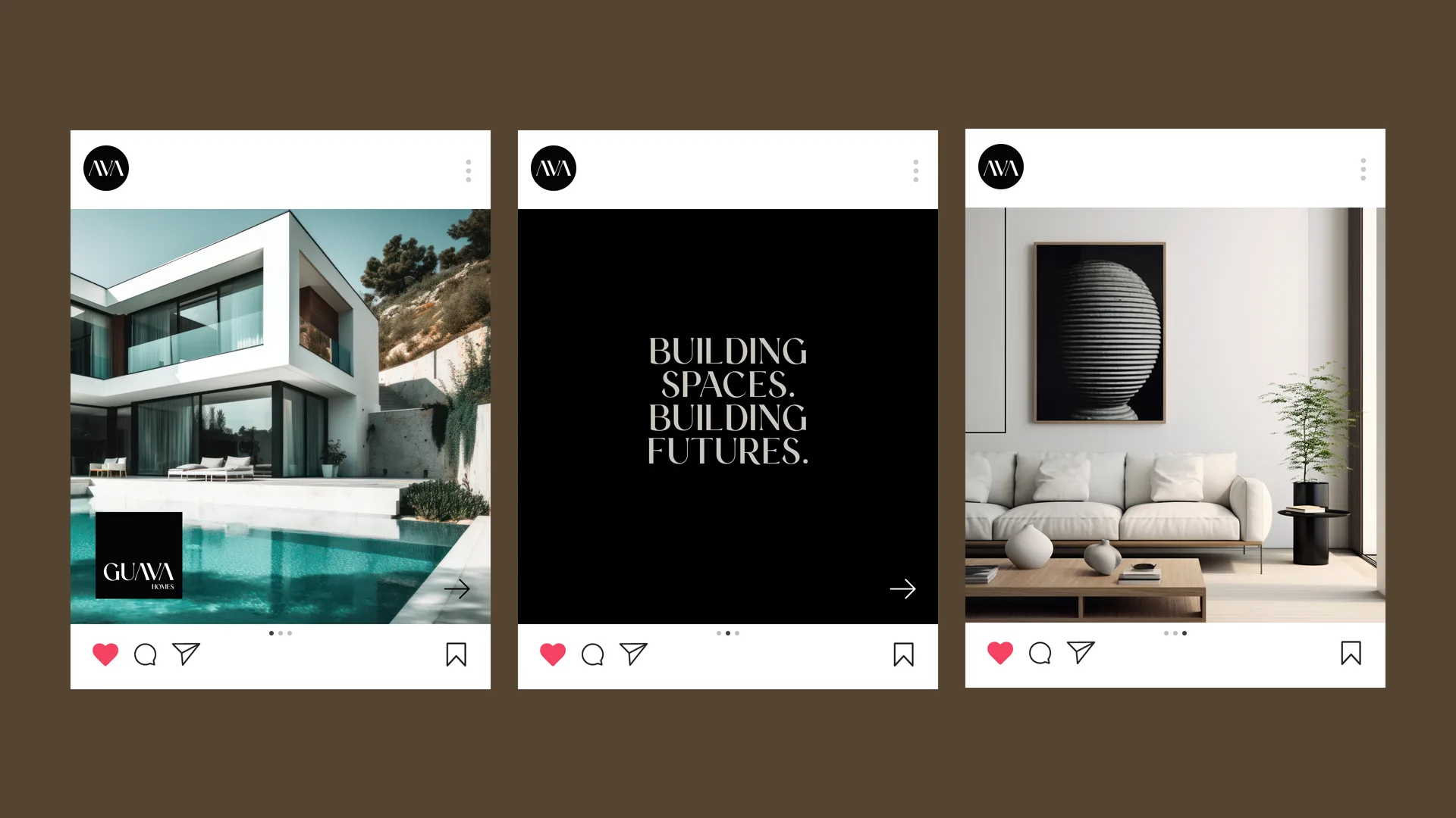
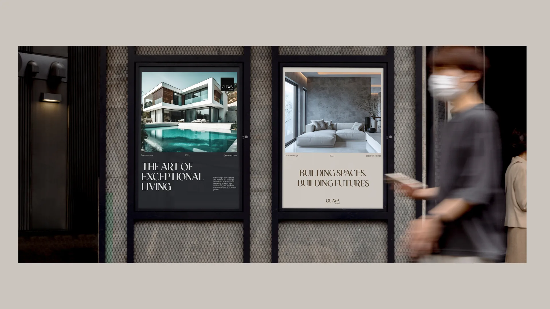
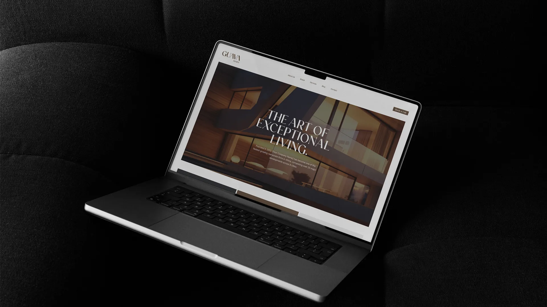
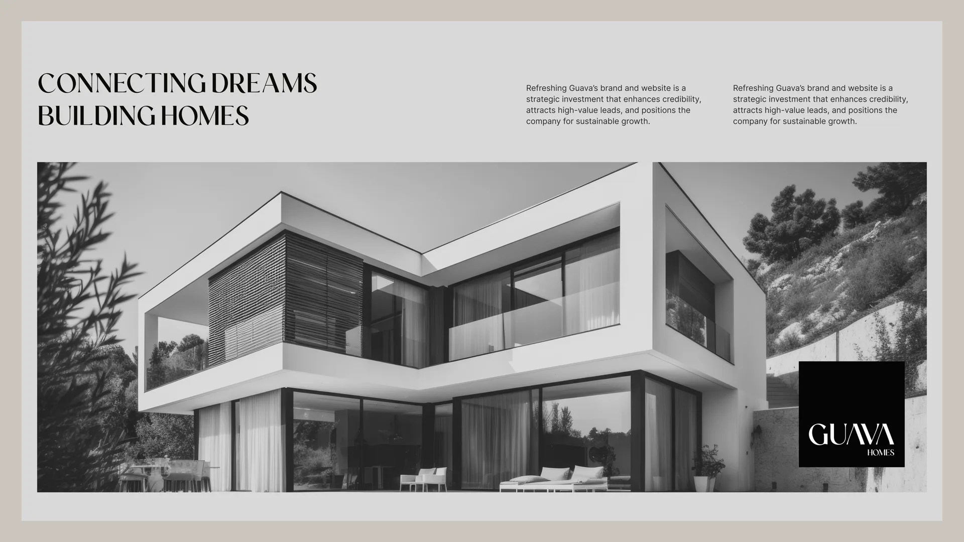
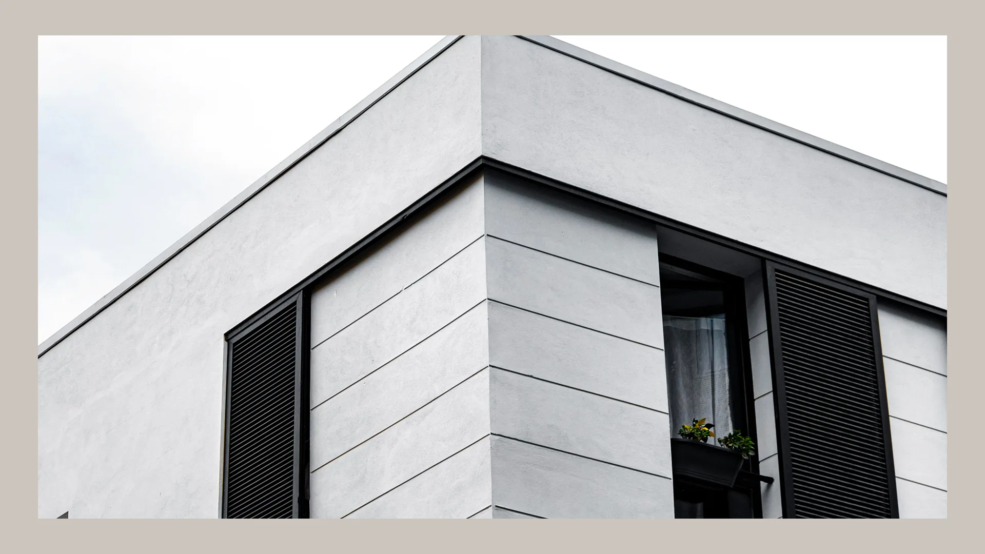
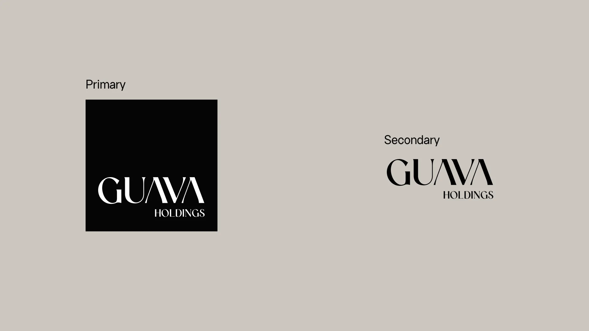
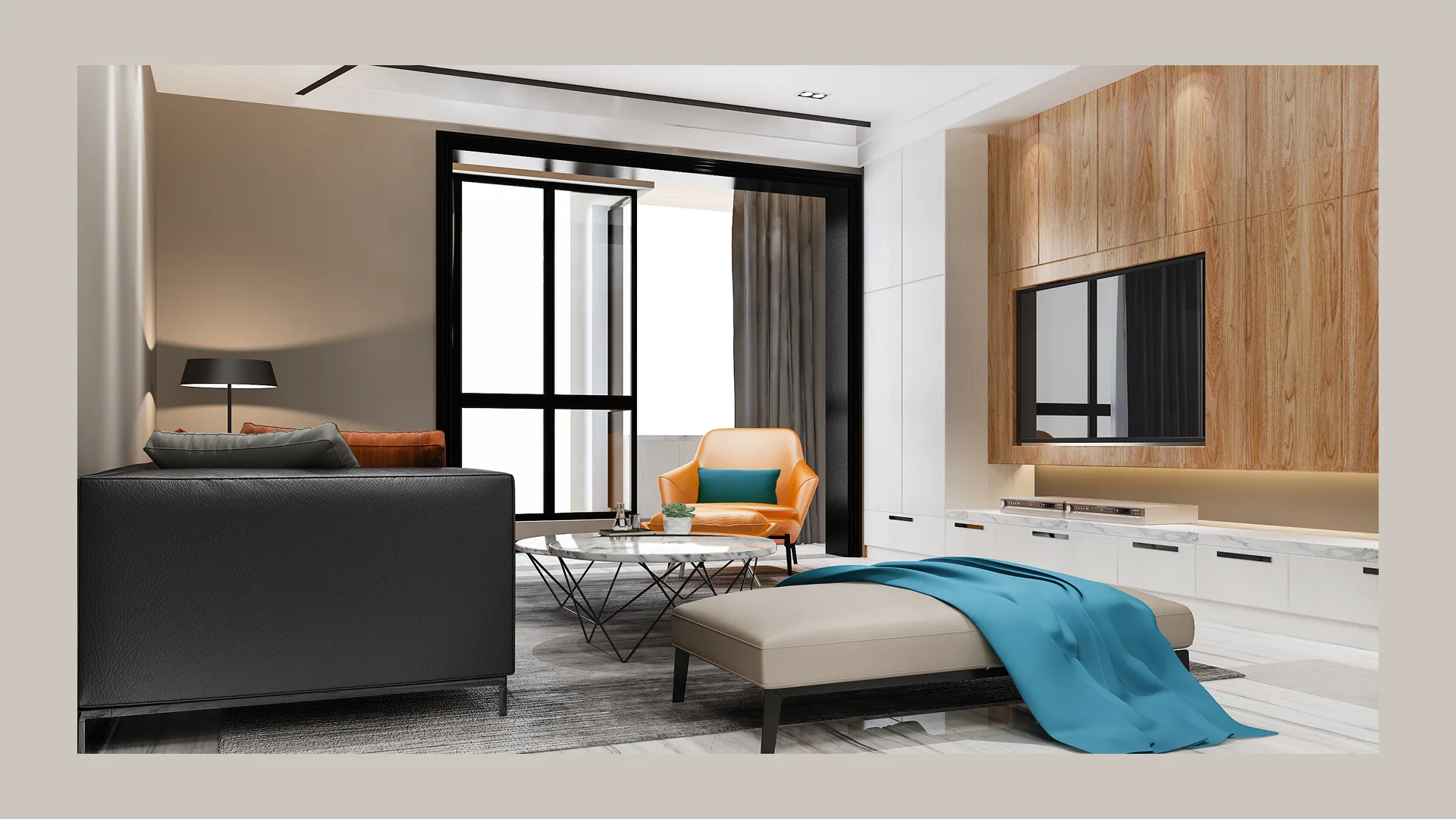
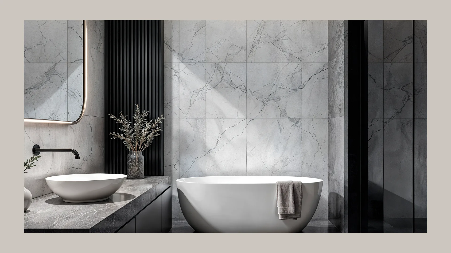
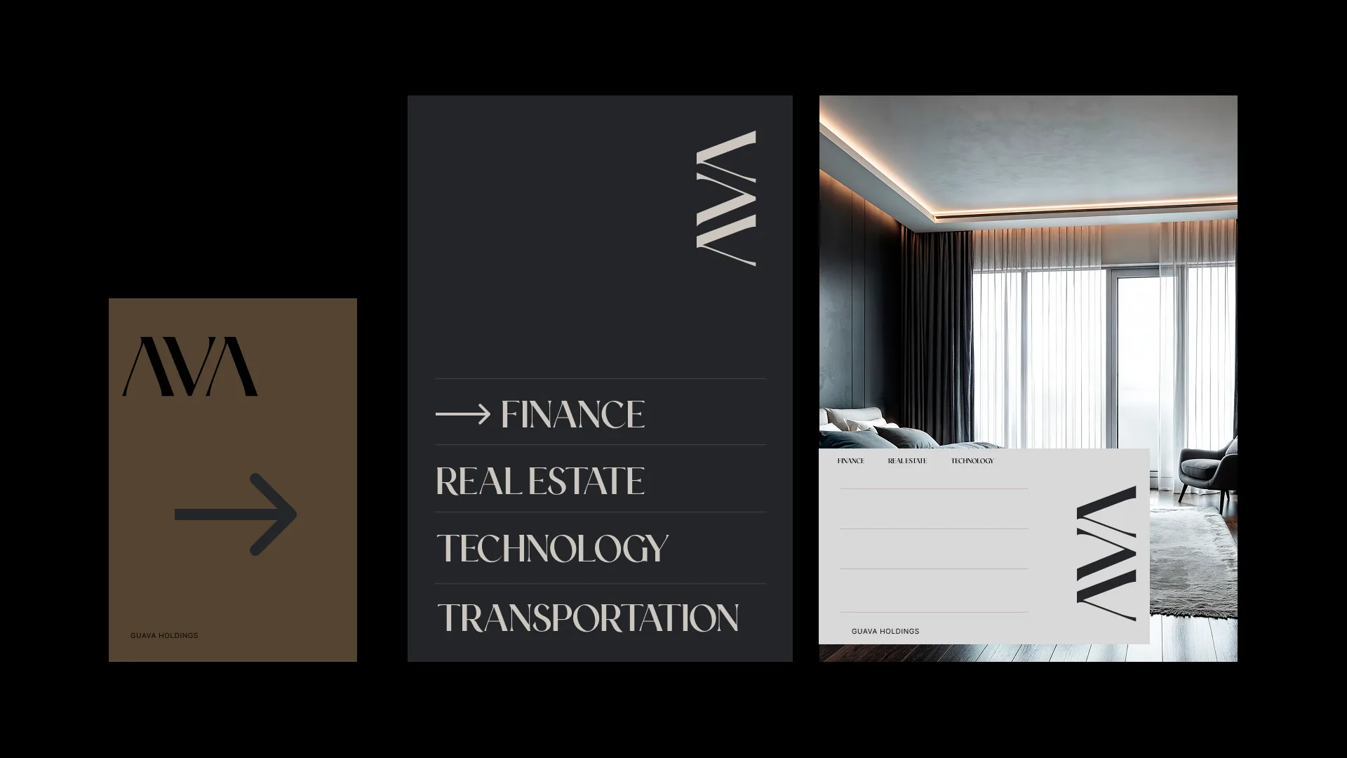
GuavaBrand Identity

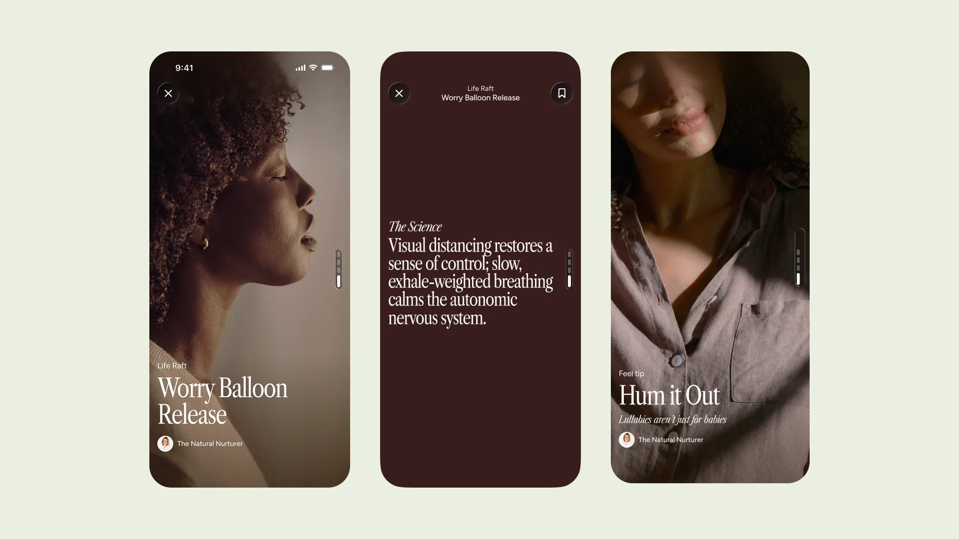
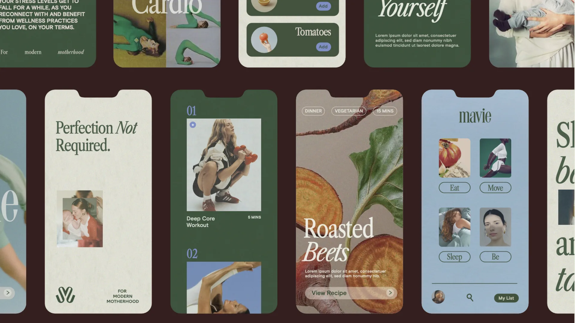
MavieMotion
9+
Years in the Industry
500+
Projects Delivered
7+
Markets Activated
4.2M+
Campaign Reach
We’re a multi-disciplinary studio blending design, strategy, and storytelling to build brands and experiences that feel alive.
About the Studio →